Remember when the phrase “Paper is Dead” was all the rage? Flash forward a decade (or two) and now it’s “The Desktop is Dead”. In 2015 Google announced it would drastically change their search algorithms for mobile searches so that web sites that aren’t responsive would see a noticeable decrease in their page rankings.
What is a responsive design?
In a nutshell, responsive design is when you have a single web site that is designed and developed to flex into various layout formats depending on the screen size the web site is being viewed on. Now more than ever it is especially important for your web site to take advantage of a responsive design as users are increasingly splitting their time online using a multitude of devices such as phones, tablets, laptops and the traditional desktop computer.
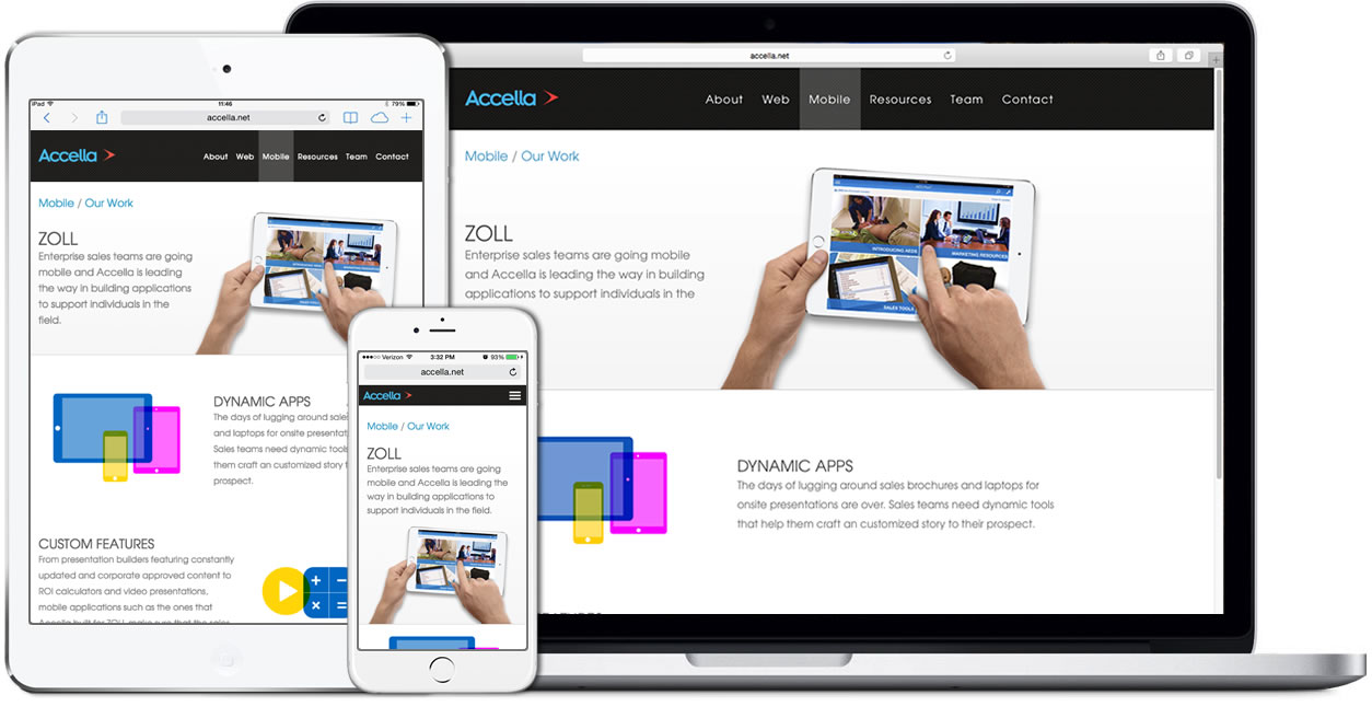
You can actually look no further than our own site as an example.
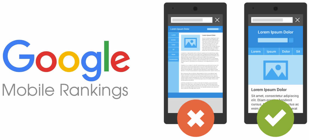
If you’re still not sure about converting to a responsive design then you do so at your own risk. A risk that not only alienates your current and potential customers but also risks your Google rankings. Google has updated their search algorithm so that when you are on a mobile device (i.e. phone or tablet) and using a Google website or Google app to search for things, Google will give the web sites that are mobile friendly higher search result rankings than those web sites that are still limited to desktop only versions. This change does not currently affect your rankings when using Google on a desktop or laptop… at least for now anyway.
While I’m generally not a fan of monopolies changing the rules for everyone on how things operate, in this instance I think it’s for the better. The way current and future customers view your online presence is evolving due to the devices we use to access that information. Creating a new responsive web site is not only a great investment in terms of allowing your site to look great on any size screen for your viewers and better protects your company from things like Google’s new mobile search results policy. Additionally, investing in a new responsive website enables your company to incorporate many of the latest design trends as well as take advantage of many new technologies that weren’t available even a few years ago to create a more interactive and compelling user experience.