Unless people have already visited the marketing website of your app or have seen a friend use the app, odds are that the first impression your app has on a potential user will be in one of the two major app online stores, Apple iTunes and Google Play. As always, first impressions are key and with the opportunity for you to be in control of those first impressions, take advantage of that opportunity!
App store profile pages have four main components: screenshots, description, ratings and reviews. As the app developer, you are in control of the first two items, screenshots and description. Google Play allows you to display up to eight screenshots while Apple iTunes allows up to five. When viewing the profile page of your app, visitors will naturally view the screenshots first so that’s your “hey! look at me!” moment! On average a user spends about 8 seconds before deciding to stay or bounce so show what your app is all about before they may decide to move on.
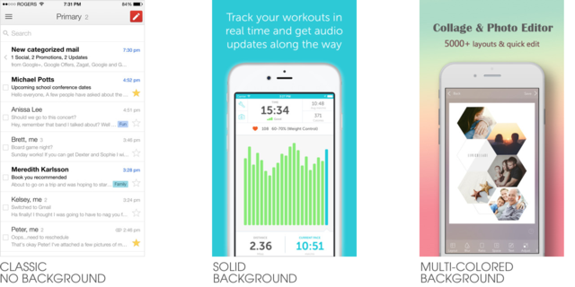
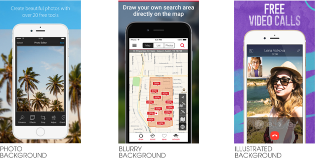
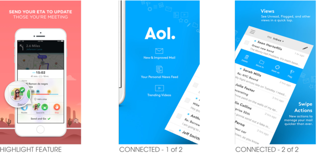
Over the years screenshot graphics have gone from simply showing (spoiler alert…) actual screenshots to now becoming custom designed marketing graphics. There are several ways to customize your screenshots but the most popular trend right now is to create an image that displays a screenshot of your app at a reduced size which then allows for a single line or two of descriptive text to highlight what the screenshot in that particular graphic is about. Custom screenshot graphics can include backgrounds with single colors, multiples colors, photos, blurred images, or even custom illustrations.
*Final Note: When choosing your app screenshots, the most important thing is to pick screenshots that best explain what the purpose of your app is!
