It’s hard to believe there was a time when the iPhone and iPad only had one size for each. Eventually the iPhone added a larger screens and the iPad added both smaller and larger screens. Today we have three sizes of screens for the iPhone and iPad. Steve Jobs once said no one wanted a bigger phone and that the iPad was the perfect size no need to go smaller or bigger. Well flash forward several years and Apple now has EIGHT different screen sizes when you include the two sizes for the Apple Watch. We’ll save Android screen sizes for another day.
Luckily, from the designers standpoint, Apple has maintained the screen width to height ratio of the screens as they’ve introduced the larger devices so old and new apps alike play nice for the most part regardless of which device you’re viewing them on.
I think it’s interesting to note that Apple’s first foray into a physically larger screen size actually didn’t take place until the iPhone 5 which elongated the screen thus adding more vertical space. That means the iPhone went through four versions at the same physical size before a larger screen was introduced but then only took one model update (iPhone 6 and 6 Plus) to increase in size, at which time two larger sizes were actually introduced.
So how do multiple size screens affect your project cost?
From a designer aesthetic standpoint, the iPhone 5 introduced a new 16:9 aspect ratio. The iPhone 6 and 6 Plus (even with their larger sizes) continued to use this same aspect ratio so apps designed in iOS 7 and iOS 8 scale up much nicer than apps did during the iPhone 4 to 5 transition.
However, there is now extra work involved to allow your app to have a seamless experience across the three iPhone sizes that are being used today. Designers and developers must now account for these three sizes during the wireframe, user interface, asset production and development process. Where we once needed to design one layout, we now need to create that same layout but factor in the ability to dynamically expand the displayed content and graphics. The good news is we don’t have to design three separate apps which would triple your budget, but we do have to design additional screen layouts for various sections of your app to help guide developers in how the initial layout of content and graphics will expand or reposition based on which model of iPhone the app is being viewed on.
Additional graphic assets also need to be produced as there are two resolution sizes being used for the current iPhone 5, 6, and 6 Plus lineup. What that means is that we now need to create two different sets of graphic elements, icons, backgrounds, images, etc… for your app in order to display the sharpest layout possible.
Below is a quick rundown of the specs for the most common iOS devices*
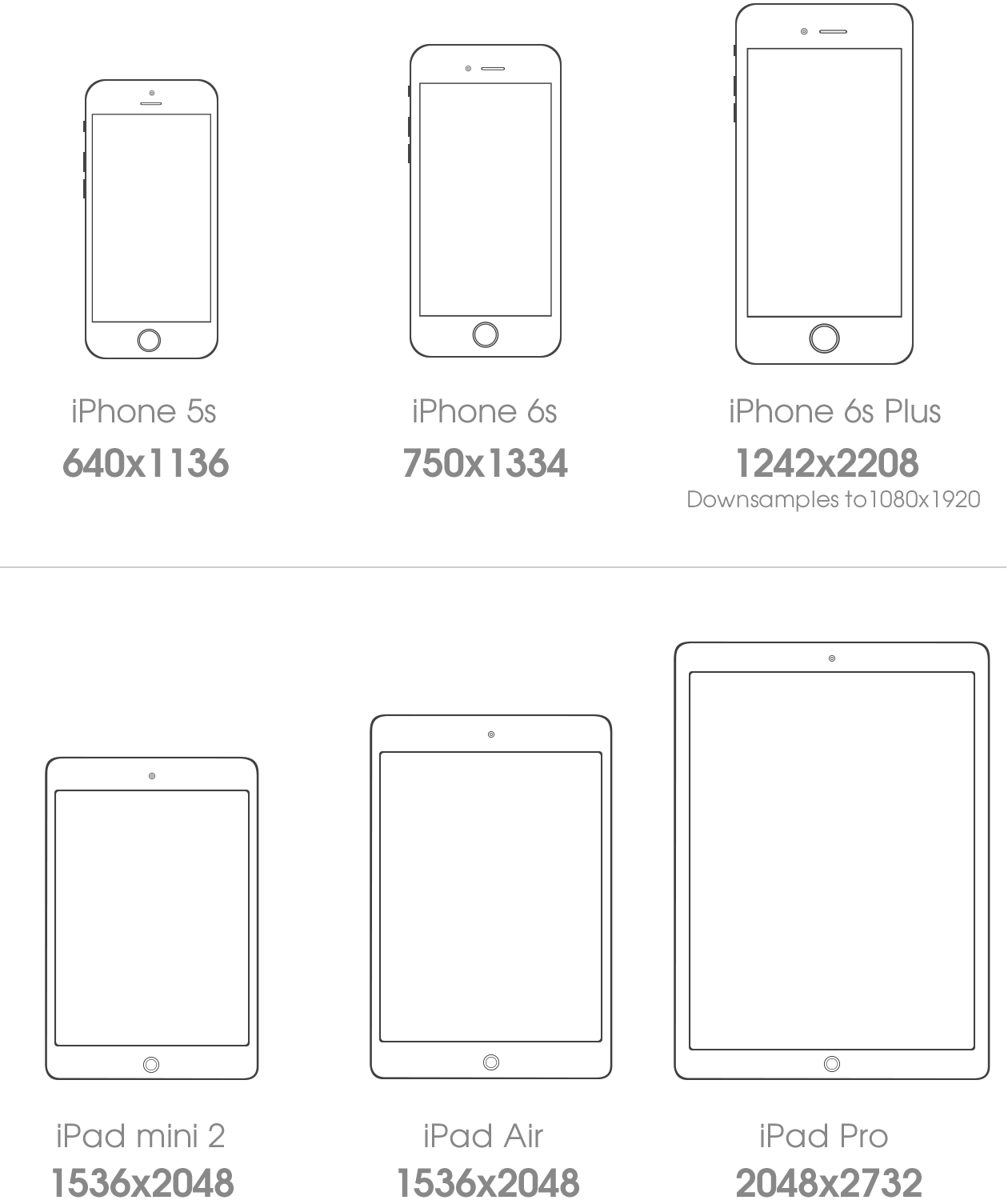
*Dimensions are in pixels and in Portrait mode.