 All Facebook Pages will be converted to Timeline Pages tomorrow, in honor of this change, Hubspot held a webinar today along with the Head of Global SMB Marketing at Facebook to give some best practices on implementing your company’s Facebook Page. Here are the top 9 tips to consider when using Facebook for Business:
- Set your Cover Photo and Profile Photo
Your profile photo is the small square at the top of your page, this should be a logo or other image that is closely associated with your brand.
Your cover photo is the much larger image that spans the page. This should represent your brand, who you are, what you do, what you are about. Consider putting in a company photo, or some logos of companies you work with. Here are some tips along with what you can’t do with your cover photo. - Add Milestones to Fill Out Your Timeline
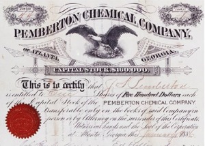
 Consider adding information about when your company started, when you launched a new product or service, when key people joined your staff. This should be an interesting, visual overview of your history. For instance, On Coca-Cola’s page, you can see their original stock certificate.
 - Pin Important Stories to the Top of Your Page
Previously your stories all were fed on your wall in a running fashion, now you can pin important stories to the top of your page for up to a week at a time. Perhaps you have an important announcement, or an upcoming event, make sure you are pinning those top stories to the top of your page. - Post To Your Page Daily
It’s recommended that you interact with your page as often as you can, which means posting to it on a daily basis. This will keep your fan base interactive as well as keep your page from going stale. If you can’t post on a daily basis, at least try and post something one or two times each week. Consider having multiple people within your company post to the page. If you want to keep it personal, you can have them “sign” their posts by adding “-jon” to the end of their comment, or whatever their name would be, you don’t have to use mine. And don’t just post promotional things for your company like “download this” or “try this today,” keep it informative and fun. - Manage your Page Through the Admin Panel
The admin panel gives you a lot more insight to how people are engaging with your page and the posts on it. So make sure to use it to see what posts and things your users like, and give them more of the same. - Respond to Personal Messages
While companies can’t directly message their fans, fans can now send messages to a company’s page. So make sure that you respond to those messages to keep the conversation going. Remember, Facebook is not about how many likes or impressions you can get, it’s how reach and interaction with your fans. This new medium of advertising offers companies a two-way version of communication never before available. - Rearrange Views & Apps
At the top of the page you have apps listed, the first one is always Photos, but the other three can be determined by the page’s admin. Make sure to put things that are interesting, engaging, and important to your fans. You can have an “about us” area, or a “recent case studies” area. Make sure to keep things fresh. - Star Updates
You can “Star” posts, which gives you the ability to take advantage of the entire width of the page. - Claim Your Vanity URL
If you haven’t already done this, make sure to get on this. By claiming your vanity URL, such as http://www.facebook.com/AccellaLLC, you give yourself an easy way to promote your Facebook page in marketing materials and online, and an easy way for your fans to find you.
Keep up with Accella’s Facebook page and watch our transformation from a blank slate to a full-on Facebook Fan page over the next month. We haven’t started yet with building out our new Facebook page, so it will be good to follow along and see what we do.


2 Responses
Well I updated our Profile Picture and Cover Photo today. I found a template online which made the process a little bit easier. Though be careful as Business Pages and Personal pages have a slightly different layout, with personal pages having the profile picture up slightly higher. That threw me for a loop for a good hour today. Also, make sure that your profile picture is at least 180 x 180, and your cover photo is at least 850 pixels wide, otherwise it won’t work.
Good Luck! Post your pages below, we’d love to check them out!
Hey everyone,
http://www.facebook.com/MTPandG is my page.. Not too creative but fairly simple and attractive. Don’t want to push ‘ HEY LOOK AT ME ‘ or ‘ LIKE THIS ‘ just clean and simple.
That link for the guides is pretty cool with how creative people can get with their Covers and Profile photos 🙂