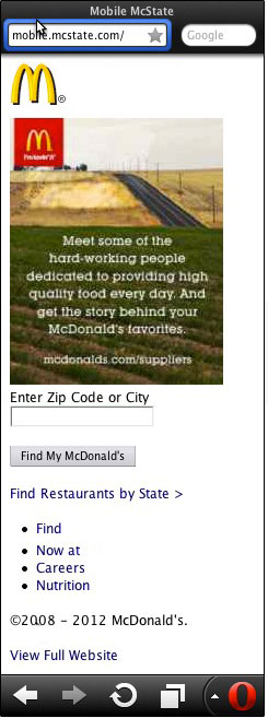
Designing a mobile website is not the same as designing a regular website, your audience is most likely looking for different information, and that information should be presented in a different way.
Consider this when designing a mobile website:

Keep it Simple
There are many reasons this old adage holds true, most importantly, a mobile website is most likely loading on a smartphone, which doesn’t have the same bandwidth as your computer at home. Adding extra images can take a while to download, significantly slowing down the load time of your page, and forcing your visitors to click the back button.
And remember, simple doesn’t have to equal bland. Just because you don’t want to have a ton of images on your site doesn’t mean you can’t make it look great. It just takes a little more thought and design, but there are plenty of mobile websites that look better than full websites.
Keep it Big
Most users don’t carry around a stylus with them when using their smartphones, so they rely on their fingers and thumbs to click on links, tap buttons, and enter in text. Make sure that you make buttons large enough to easily click without hitting the wrong button, and don’t group links together so that it’s difficult to click the right one.
Make sure the text is also big enough to easily read on a mobile device. The screen size is much smaller than a PC or laptop, and people don’t want to have to hold the phone up to their nose just to read it.
Keep it Small
Don’t overdo it. Your visitors don’t need to see everything that is on your main site. We advise our clients to keep their mobile site small, and easy to use. Think about the information that your visitor would need to see on their phone. Most likely contact information, about your company and what you can do for them. You don’t need to have your entire blog or 10,000 page catalog optimized for mobile. However, make sure that you have a link that will take them to the full site from their mobile device.
Contact Forms Vs Click to Call
Don’t forget that the user is actually holding a phone. While smartphones are very useful for a wide variety of apps, the simple fact is that it’s still a phone. So while you should have a contact form on your mobile site (and a very basic one at that), not having an easy “click to call us” button is a missed opportunity. The user is telling you they are interested in your brand/product by simply being on your site, give them an easy way to take the next step.
Test Across Platforms
Make sure that the site you design will play nicely with the vast number of devices out there. iPhones, Androids, and yes, even BlackBerrys need to be tested with your new site, and don’t forget to test multiple browsers for each device.
We’ve worked with many of our clients to build a mobile optimized version of their website. In many cases, it involves thinking like their user and what information they would need. It is basically a trimmed down version of their existing site, with a lot of the flash and graphics toned down (or eliminated) and the text trimmed to just what is necessary. Give us a call if you need help creating a mobile site for your business.


2 Responses
Hi there,
I was looking to start with mobile website developing but, wasn’t sure enough how to do that. This article really helped me out on basic considerations I should made.
Thanks to Author.
Me too. Great article. Thanks.